BT
Re-imagining the BT brand


BT is changing - and the brand identity system has to be flexible enough to allow great creative work across any media.
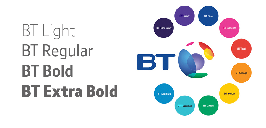
The system is comprised of three basic elements - the logo, the typeface and the colours.
We worked with the talented chaps at weareseventeen who created a new shiny 3D moving version of the logo designed especially for screen and Mr Bruno Maag (of DaltonMAAG fame) who provided two more weights of the BT font. Then the colours in the palette were tweaked to work better on screen (and sampled directly from the logo) and a few new ones added to the mix.
- Brand identity
- Print design
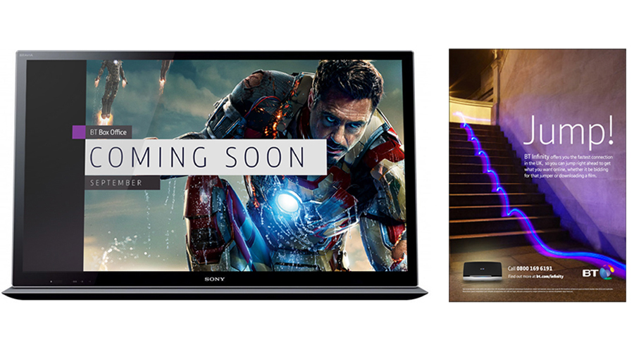
- Website design
We redesigned the brand site (www.btbrand.bt.com for those with access) and showed how these new elements might be best put to use across all media and we created a stack of new templates for the downloads section.
The BT logo is called 'the Connected World' - which is even more relevant now than it was when it was created. This version - created by weareseventeen (creators of the fabulous new BT TV idents) - reflects BT's role helping people thrive in a changing world.
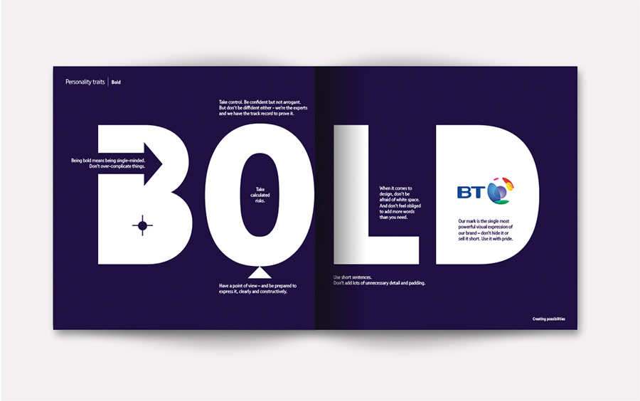
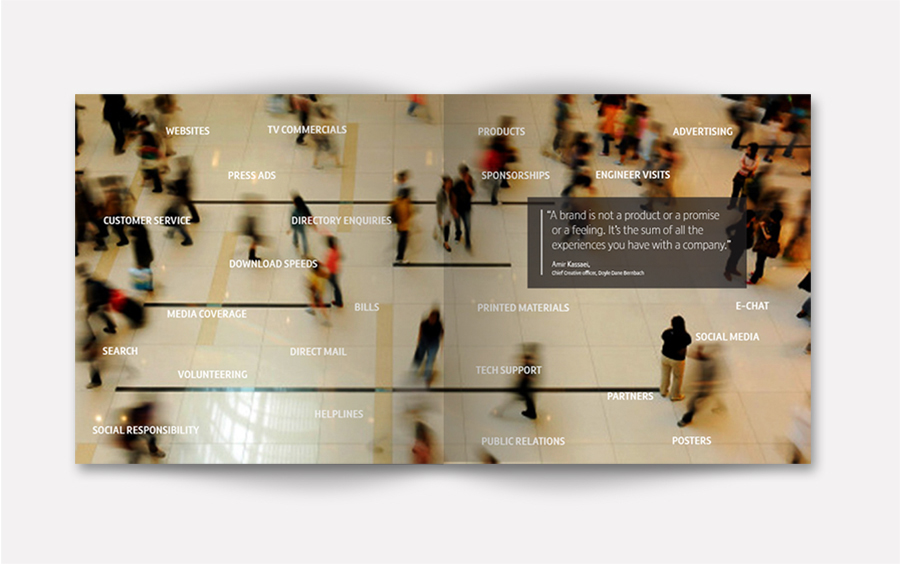
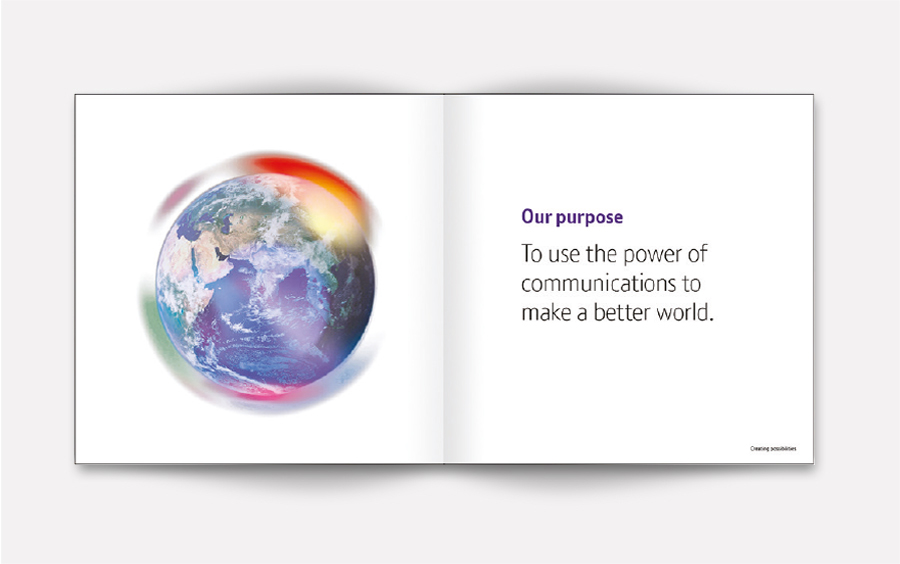
Spreads from the BT brand book